7 TIPS TO INSTANTLY NAILING NORDIC DECOR
Lauren Graham
Maximum style, minimum fuss. A statement that sums up the basis of all Scandinavian design, where simplicity and function converge to produce spaces that are light and airy, yet cosy and livable. Long winters close to the North mean a focus on creating light wherever possible, whilst a love for the outdoors is often reflected in the use of natural elements.
Clean lines and minimalism combined with extreme function & form that produce warm living spaces? An interior style that is achievable on any budget, and at any scale? It's no wonder the world is currently obsessed with Scandi style.
Although simplicity is the key to Scandinavian interiors, recreating the look for yourself can be overwhelming. We've simplified the design process by breaking it down into 7 key principles:
1. START FROM THE BOTTOM
The cornerstone of Scandinavian interiors starts at the bottom with light, wooden flooring in various shapes and forms. Whether it be modern white washed boards, light herringbone parquet or simply a coat of white paint over old wooden flooring, white wood is generally a key starting point.
2. CALMING COLOUR PALETTES
The majority of Scandinavian homes are characterized by a cool, neutral colour palette. Think stark white walls in combination with cool greys and light stone to maximize light. This is often offset by strong pops of colour in clean designs, or perhaps with a strong geometric print, used in moderation, of course.
3: AU NATURAL MATERIALS
Scandinavian homes always pay homage to nature. Wood, wood and more wood. Think wood cladded walls, wooden chairs and wooden boards in raw, natural tones. Mixing honest, raw textures with metallics like copper, leather and stone, alongside some indoor greenery completes the look.
TOP TIP: Yellow woods detract from this look, remember to wash pine and other yellow-toned woods to create something that's more "ashen" or white in tone.
4. TEXTILES
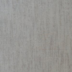
A space designed in the Scandinavian style isn’t visually weighed down by a lot of heavy fabric. Textile accessories are used sparingly, but for maximum impact. Scandi interiors call for dry-look linens and textured plains in array of monochromatic tones. White, stone and cool grey plains are indicative of typical scandi textile choices. But don't forget the pops of texture and colour you can find when accessorizing with velvets, geometrics and folksy art prints. The key? Keep it simple and use colour and pattern in moderation for maximum impact. Take inspiration from collections such as Cube, Velour, Southbank and Oslo:
OSLO
As the name suggests, collection Oslo was design with Nordic themed interiors in mind. This perfectly textured collection of plains is hard-wearing, yet soft to the touch making it perfect for upholstery, curtaining or accessories.
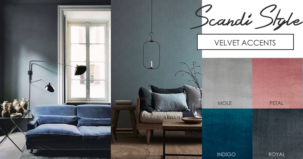
VELOUR
Modern Scandinavian interiors often offset the clean lines of functional furniture pieces with the rich softness of velvet. Collection Velour offers a wide range of colours to recreate this simple, yet luxurious aesthetic.
CUBE
Strong geometric shapes and printed accessories are a hallmark feature of Scandinavian interiors. We love the idea of mixing the monochromatic geometrics of prints of printed cotton collection Cube with raw woods and natural materials.
SOUTHBANK
On the other end of the spectrum, retro Scandinavian textile designs often feature contemporary floral motifs (particularly the poppy flower), architectural silhouettes and an abstract coordinates in strong colour combinations. In this regard, Collection Southbank features these distinctly Nordic influences.
5. FUNCTION & FORM
Two of the most definitive features of these interiors are function and form. Although very pleasing on the eye, Scandi interiors are first and foremost functional spaces, interiors designed for living with a pragmatic approach to decor. When it comes to form, only clean lines will do.
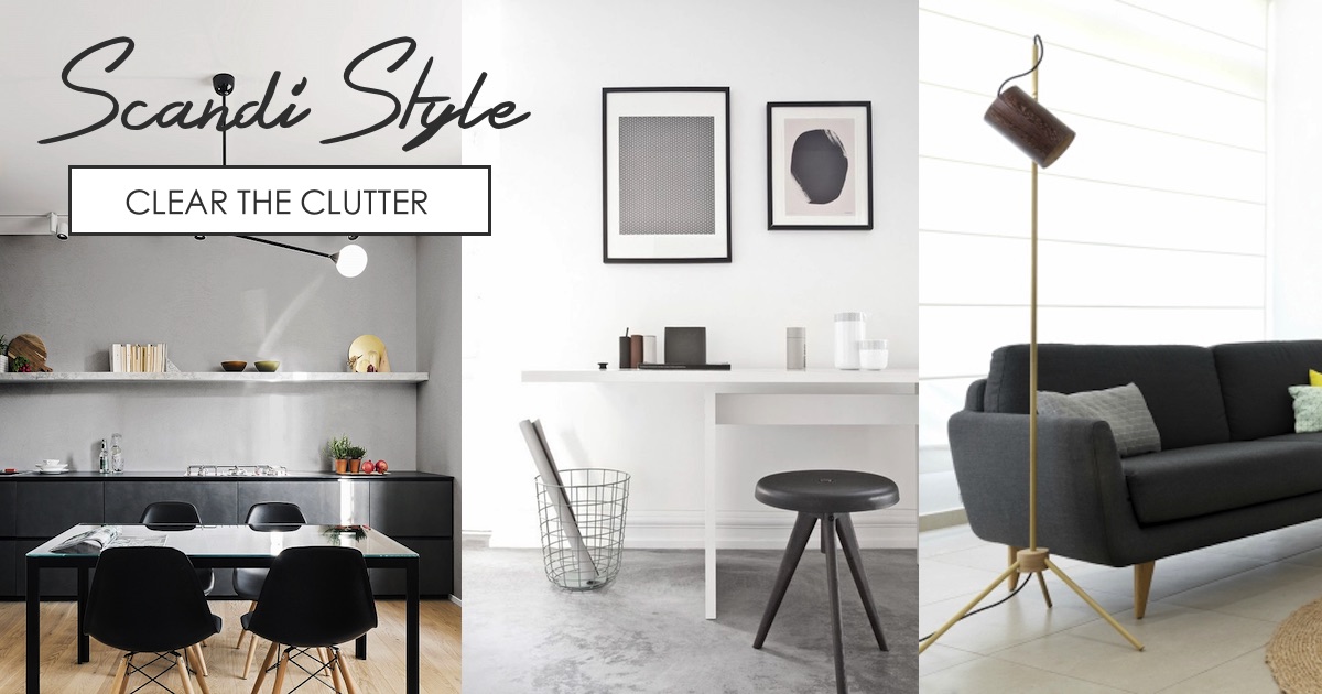
6. LESS IS MORE
Pack away the knick-knacks. Immediately. This look is all about minimalism so only the bare essentials need be within sight. When it comes to accessories, prioritize quality over quantity. Statement pieces with clean lines and stark contrast will complete the look.
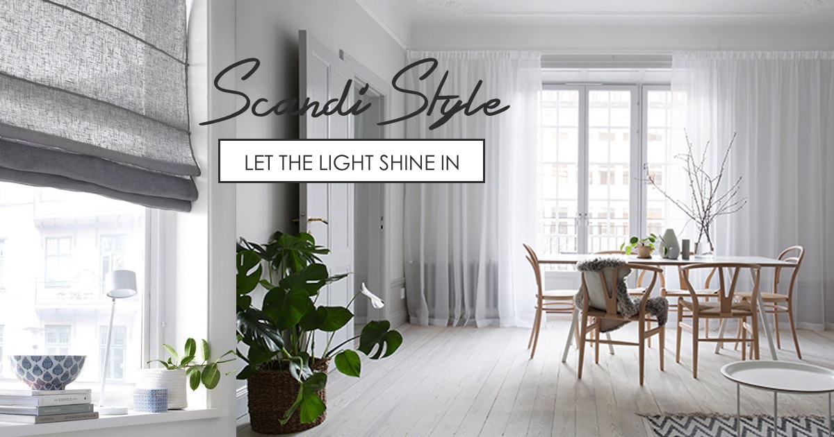
7. WINDOW TREATMENTS
In a design style centered around prioritizing light, window treatments are often sheer or translucent in light, uncomplicated materials with a simple finish.
MAXIMIZE LIGHT WITH THESE SHEER CURTAINING FABRICS:
QUESTION CHARCOAL
CLOUD WHITE
MISTY EARTH
MISTY GRAVEL
MISTY MIST
QUESTION DUNE


